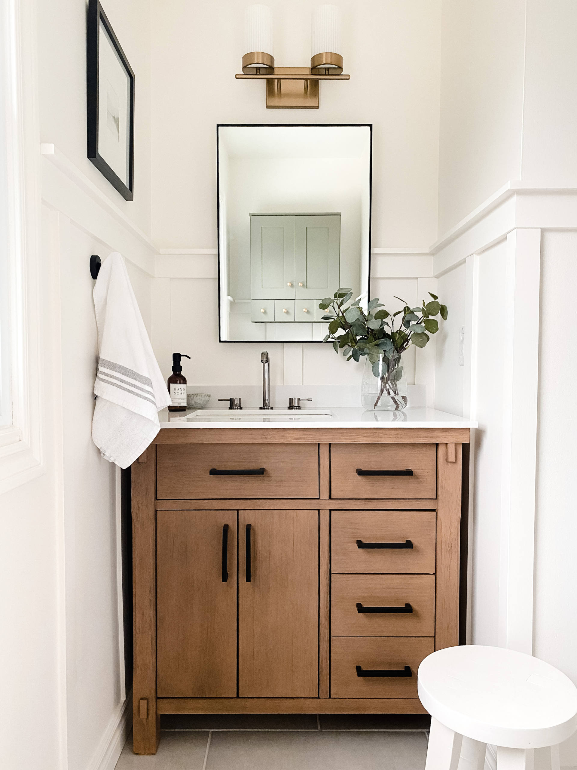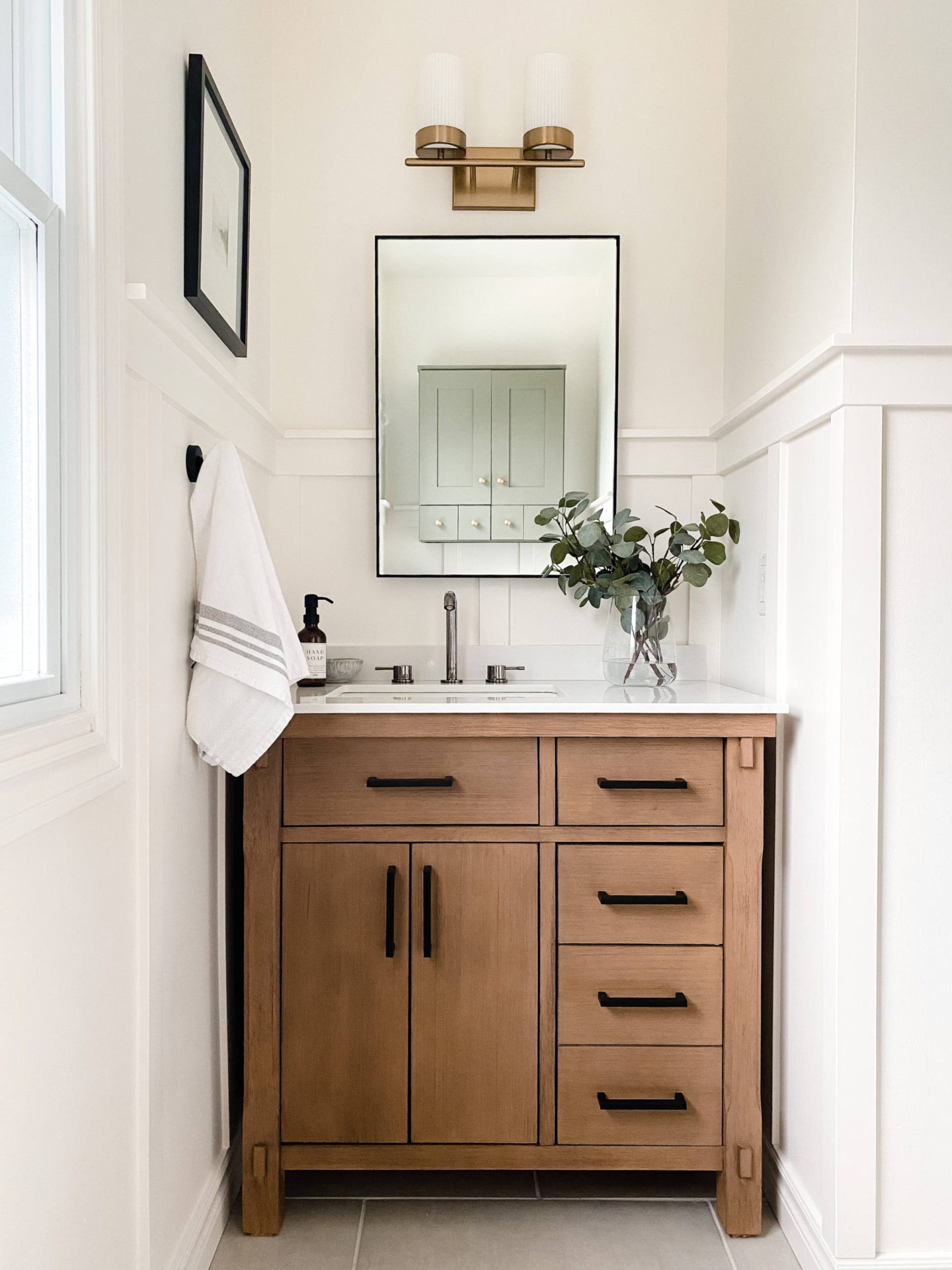
I’m so excited to be revealing this bathroom to you all today! This bathroom has been a work in progress since we moved into this home 11 years ago and I am thrilled to finally complete this space. We spent a fair amount of time over the past 10 years thinking about what we wanted the design to be and how it needed to function best for three small children. Over the past two months we have been working on updating the space and making it one that is not only functional for our family but also incorporates quality pieces, a transitional modern design, and focused on sustainability.
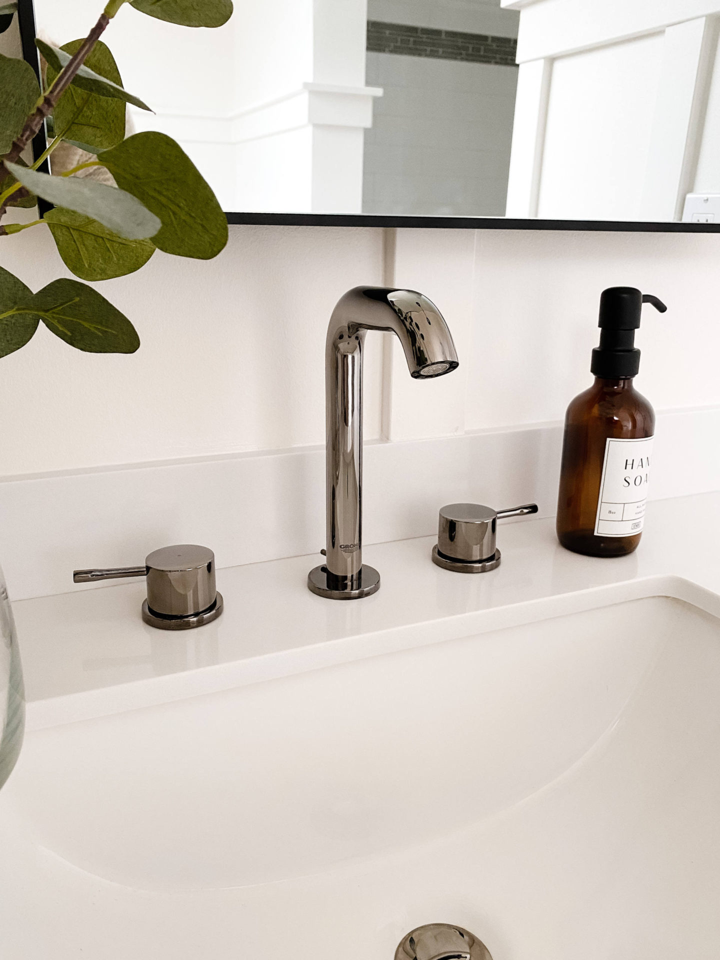
Bathroom renovations can be daunting and costly, but researching what products to invest your money in can make the decision process much easier! I teamed up with GROHE, a brand dedicated to providing innovative water products, for this project to add some beautiful fixtures to the space and share some options that are both functional and sustainable bathroom solutions.
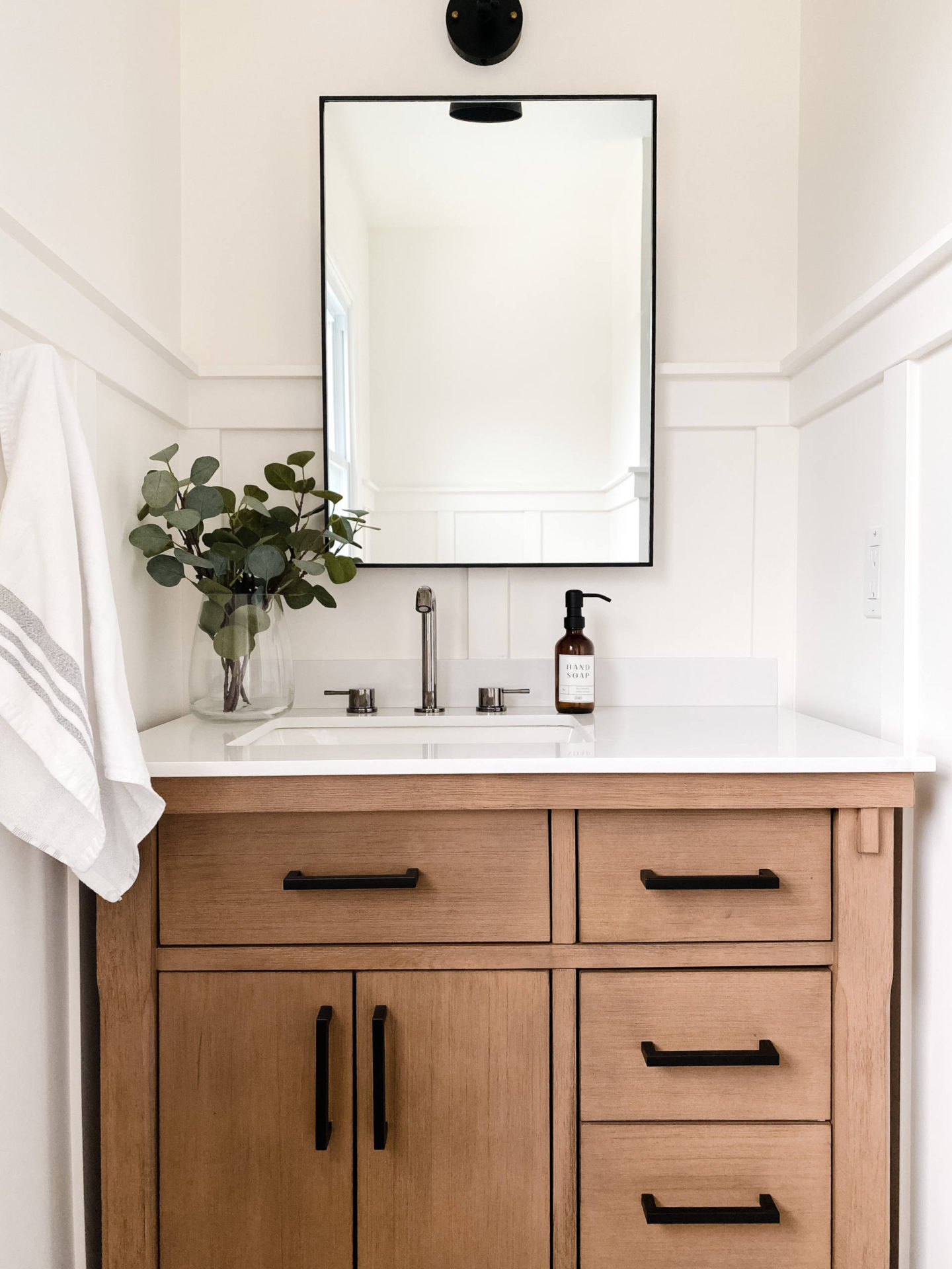
Let’s start at the beginning. Here’s what the bathroom looked like when we moved in:
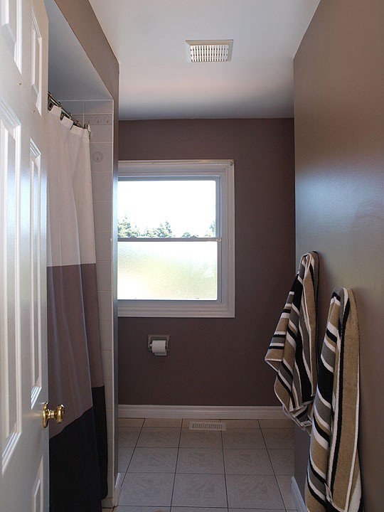
and here’s what we did to update the space 11 years ago:
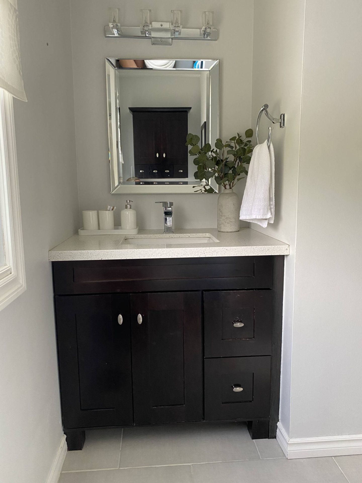
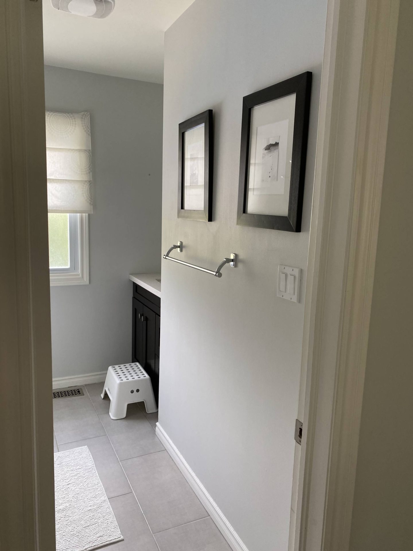
It functioned fine, but the vanity and faucet weren’t in the best shape and we wanted something that would last for the next 10+ years with our 3 young kids. We determined the following pieces were in good shape and were going to stay the same:
- Floors
- Shower tile
- Tub
- Toilet
And the following items needed an upgrade:
- Vanity
- Faucet
- Shower/tub fixtures
- Paint
- Baseboards
- Tub surround
- Storage cabinet
- Plumbing location
- Bathroom accessories
Once we came up with a plan, we put it into a moodboard:
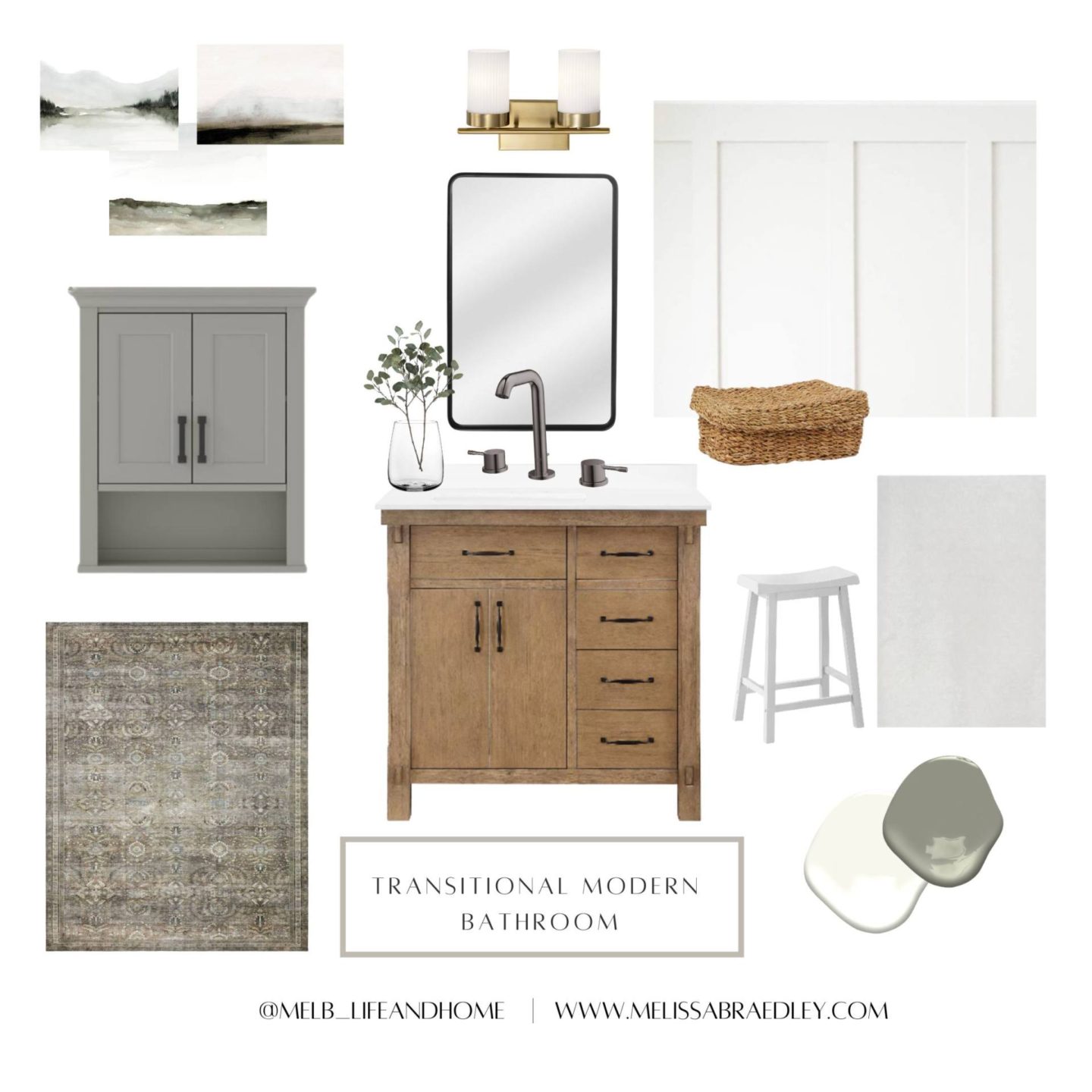
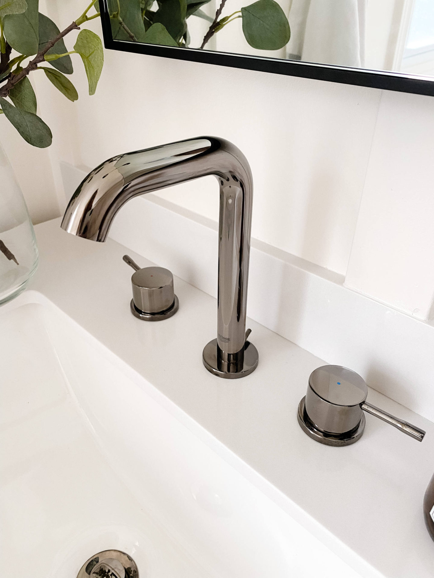
We decided that starting with the fixtures and vanity were top priority so we set aside a good amount of our budget for those areas. Once we chose a vanity, we decided on a widespread faucet to act as a classic but bold centerpiece and compliment the natural wood of the vanity. The Essence Widespread 2-Handle Bathroom Faucet from GROHE was the perfect choice with its sleek design and long-lasting quality. One feature we loved about the faucet is its GROHE StarLight® coating that wipes clean and maintains its beauty and shine for life – a must-have with young kids! The faucet we chose came in a variety of five different finishes, from Polished Chrome to their gold Brushed Cool Sunrise, but we loved the Hard Graphite finish – we felt it was a perfect combination between traditional and modern and would stand the test of time in terms of style.
.
We picked out the other items we needed for the space, decided on some wall mouldings and went with our usual Simply White paint for the walls and a fun colour accent on the wall cabinet.

Then we got to work.
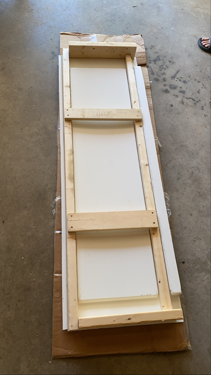
We began with fixing the tub issues, where Ian built a support for the tub skirt to sit against:
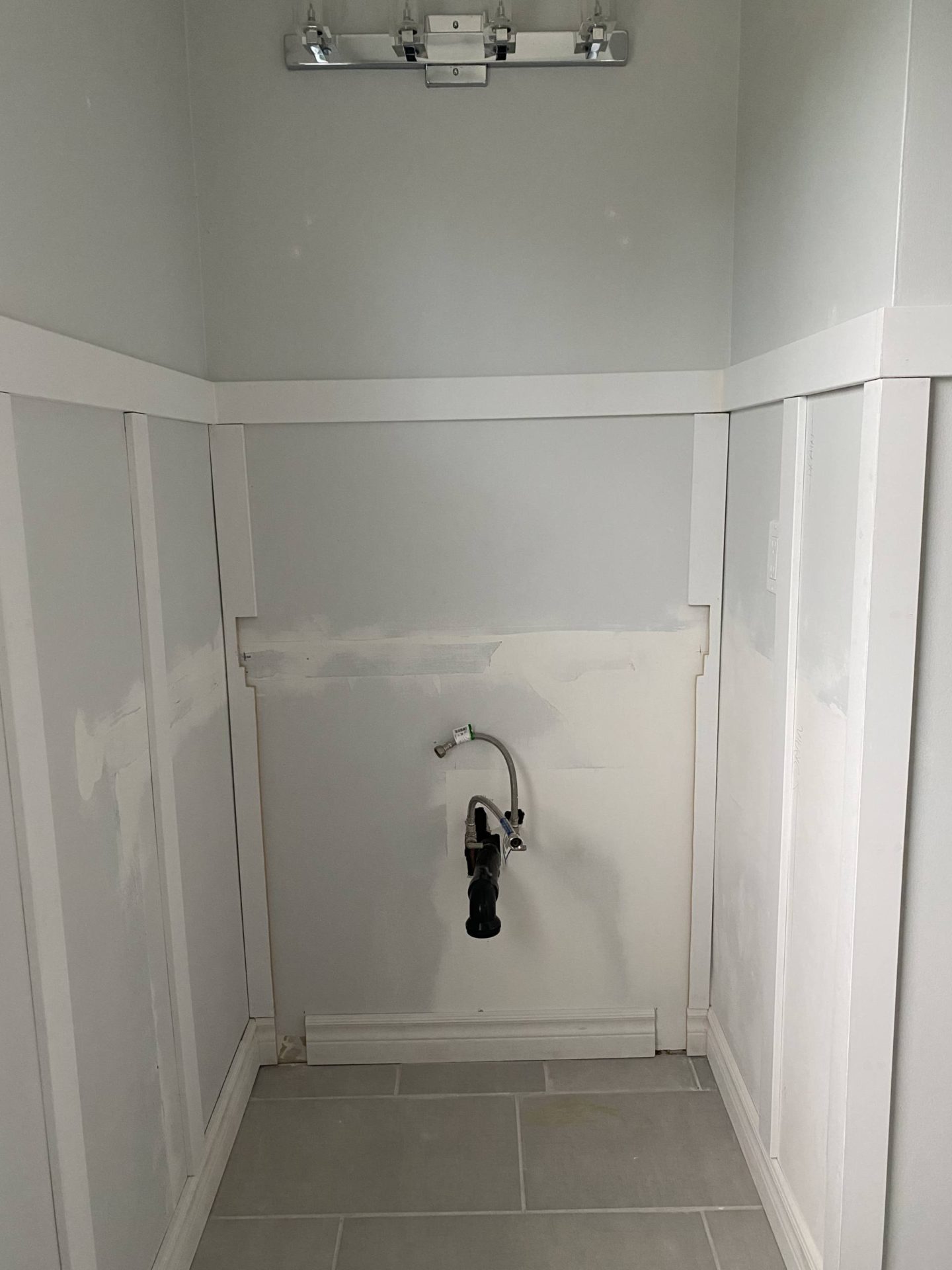
We also had to fix/redirect the plumbing and re-drywall behind the vanity:
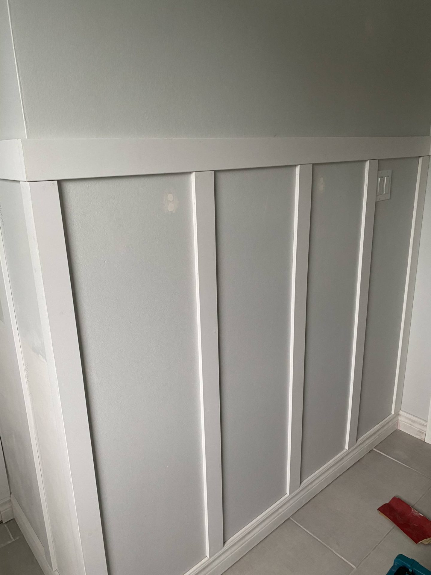
We added mouldings to the walls and painted everything a fresh coat of paint:
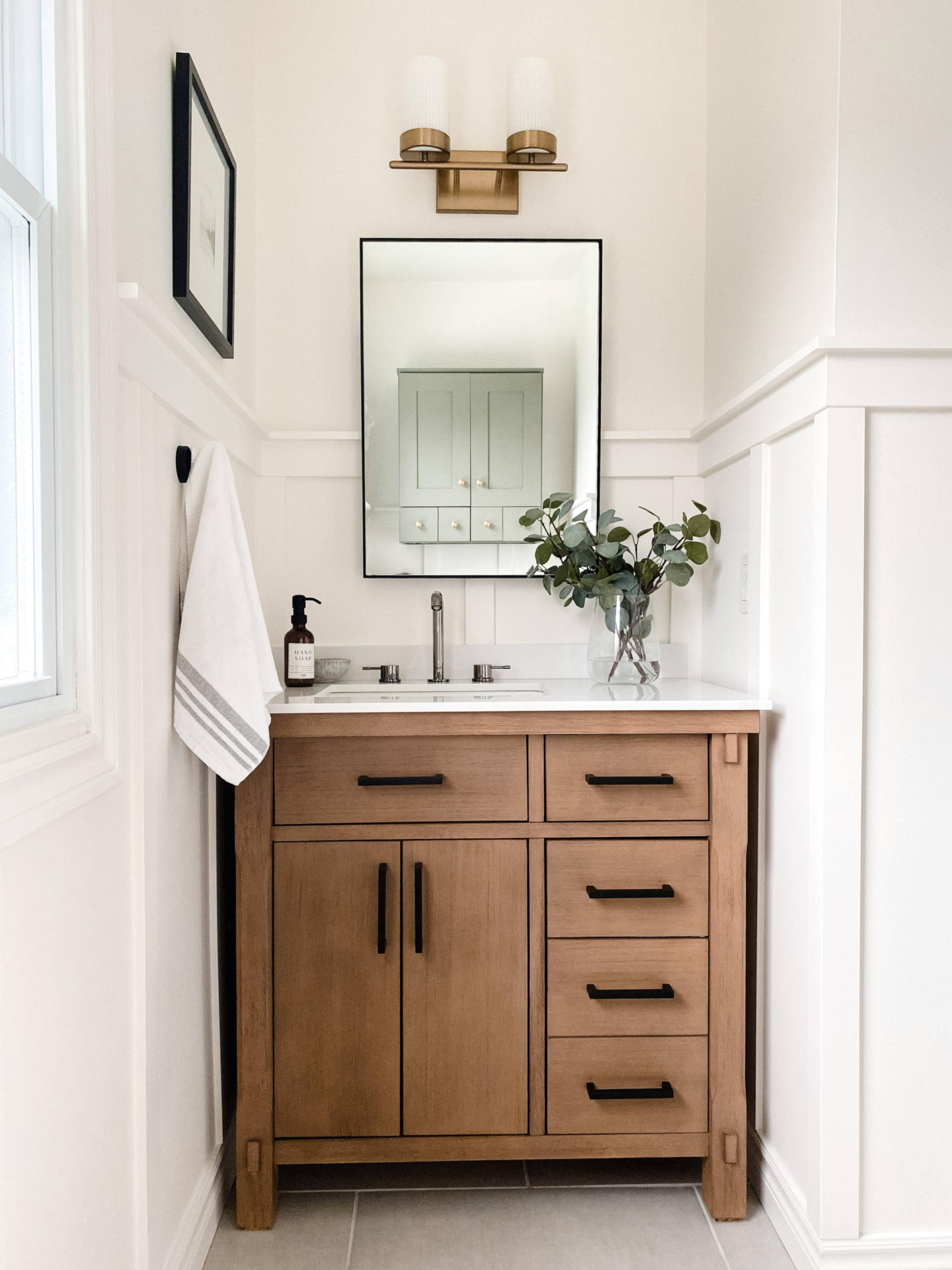
Finally, we styled the space and ended up with exactly what we had envisioned!
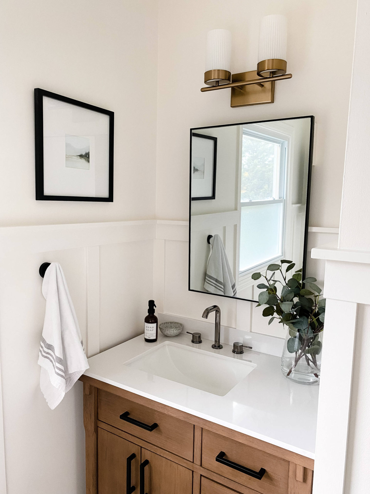
We’ve been using the bathroom for a week now and I can confirm that the faucet wipes clean with ultimate ease, which is very important with 3 young kids! The handles are smooth and easy to use and an added bonus is the GROHE EcoJoy technology, which reduces water usage without sacrificing performance. Additionally, the adjustable water flow eliminates splashing – super helpful for kids that love playing in the sink! The only thing we were concerned about was the potential waste of water if and when the kids forget to completely turn off the faucet, but the ceramic disc valves ensure a lifetime of drip-free operation, so no worries there!
We’ve noticed a big difference in choosing quality fixtures, specifically how well they function and beautifully complete the space. We knew that investing in pieces from a lead global brand like GROHE would offer complete, lasting bathroom solutions for both the sink and shower, which helped us make decisions quickly and with confidence.
Overall, we wanted to create a space that was functional, combined both traditional and modern elements, and incorporated sustainability through water-saving products. GROHE fixtures helped us to complete the look we envisioned with top quality and style.
Up NEXT: Part 2 – updating the shower area! Stay tuned for the second half of this bathroom update!
Sources:
Sink Faucet: GROHE – Essence New in Hard Graphite
Light Fixture: Kichler Lighting
Vanity, stone top and sink: Home Depot
Mirror: Amazon
Print: Collection Prints
Vanity Hardware: Amazon
Amber glass soap dispenser: Emily Michelle Home
Wall Hooks: Amazon
Faux Eucalyptus: IKEA
Vase: IKEA
Cabinet hardware: Amazon
Paint: Walls- ‘Simply White’ by Benjamin Moore
Paint: Cabinet- “Stormcloud Grey’ by Benjamin Moore
This post is in partnership with GROHE Canada. Thank you for supporting this blog and the brands I choose to align with.
#GROHEDesign #ShapingTheFutureofWater #sponsored
